SCOLARI'S
UI/UX design
Visual design
Art direction
Problem: Customers loved the food but hated the long wait times.
Solution: Redesign the brand and ordering system to match food quality with service speed.
Scolari’s Gourmet Burgers is known for bold flavors—and equally bold wait times. My role was to redesign the brand and full customer experience: identity, food-truck wrap, website, online ordering, and an on-site tablet system. Early user research revealed a key friction point: people loved the food but dreaded the line. This insight guided every redesign decision. The final system aligns brand personality with operational efficiency, creating a visual identity and digital workflow that finally match the quality of the food.
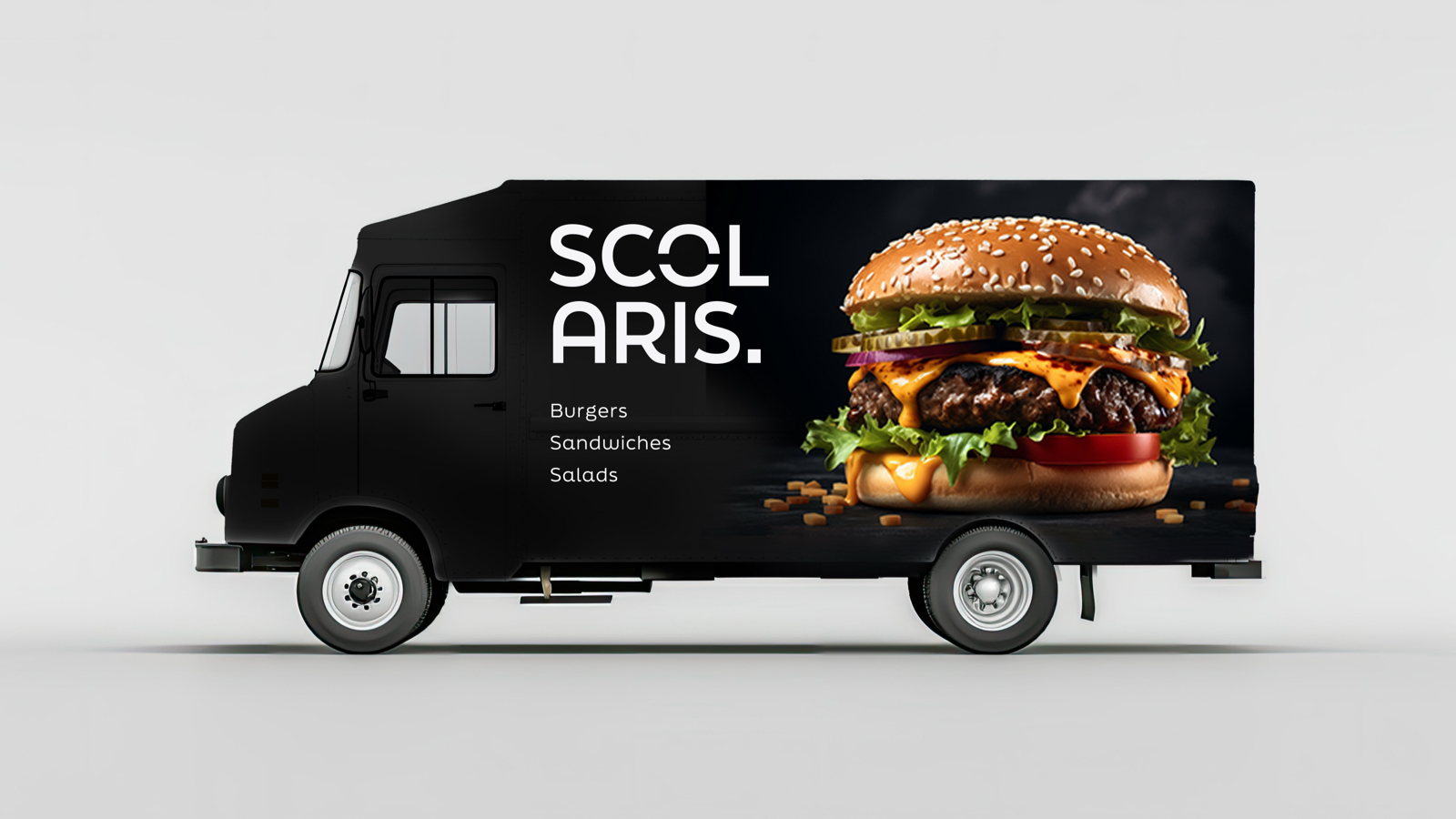
The rebrand began by rediscovering Scolari’s core personality: bold, handcrafted, East Bay grit. The previous system lacked this energy, so I rebuilt the identity with a more expressive, modern structure. Logo exploration included dozens of “S” monograms inspired by burger silhouettes, grill marks, and street-food typography. User preference testing guided the final selection—a mark that balances warmth and confidence, remains legible from a distance, and performs consistently across digital and physical touchpoints. This bold, high-end direction was intentional, mirroring the food itself: bold, elevated, and crafted with precision.
The style guide incorporates charcoal, mustard, and tomato-red hues chosen through color-testing for strong visibility on signage and mobile screens. Paired with refined typography, photography direction, and UI specifications, the system achieves a cohesive identity that feels handcrafted yet unmistakably contemporary.


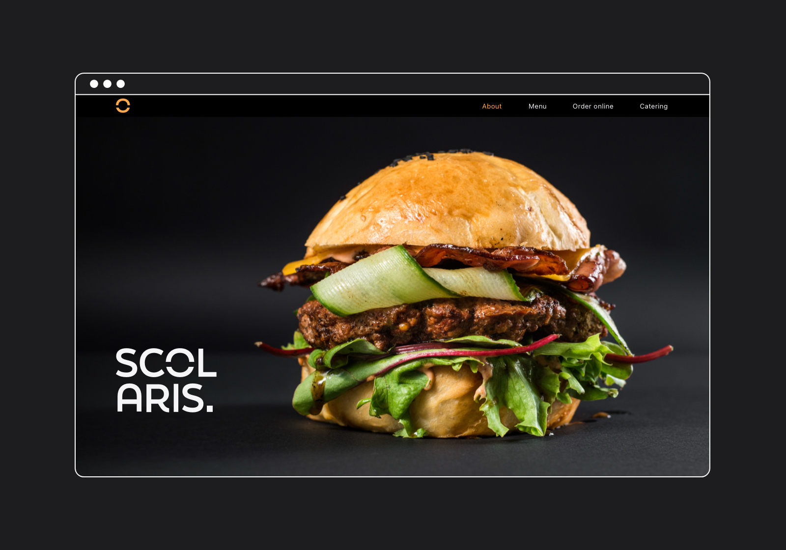
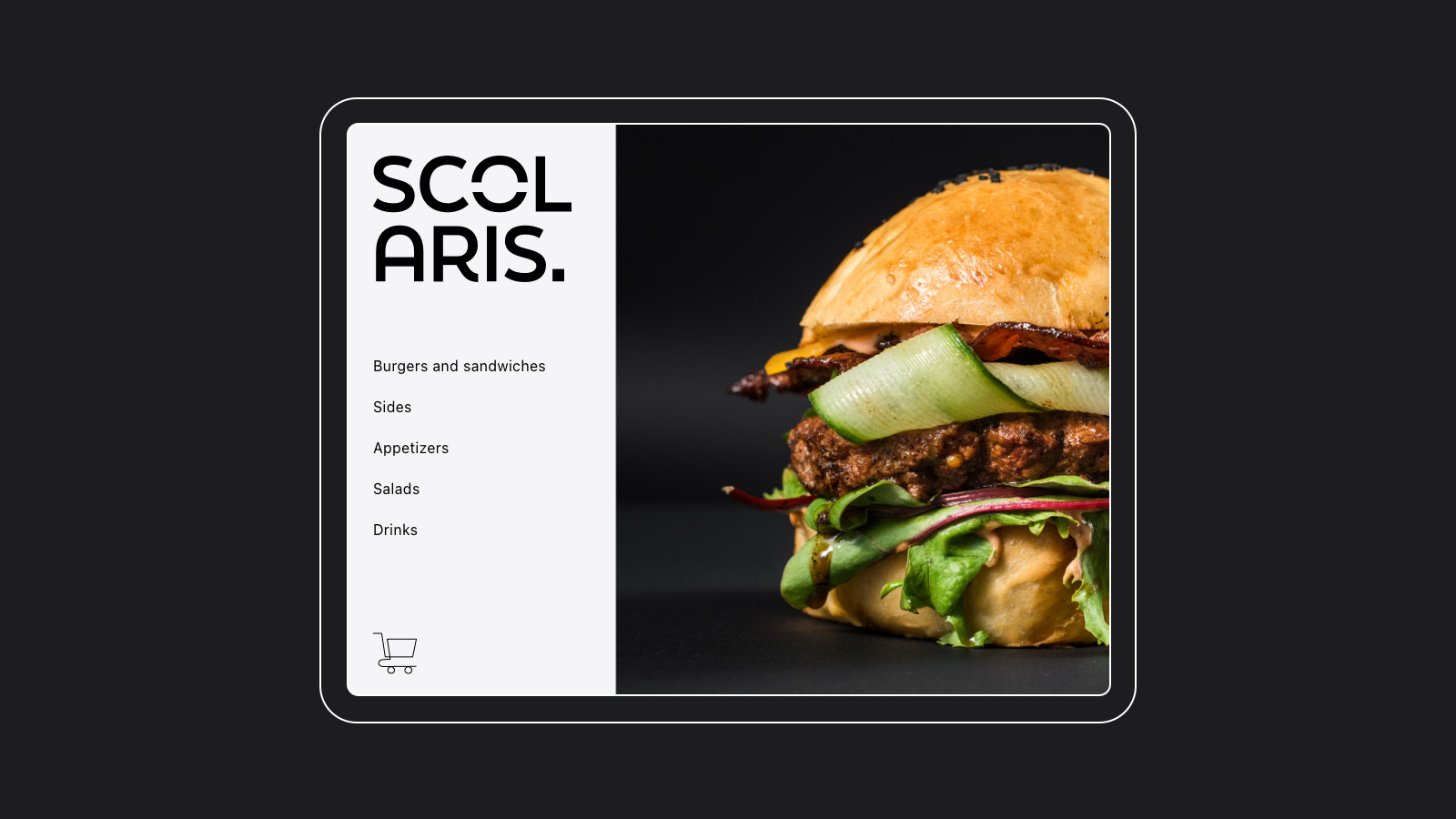
UX research and competitor analysis made user priorities clear: fast access to the menu, hours, and ordering. Card sorting exercises confirmed that the old site buried essential information, creating unnecessary friction. The redesign emphasizes clarity and speed—large tap targets, stripped-down navigation, bold imagery, and tightly edited content. Adding online ordering directly addressed the primary pain point identified in interviews: the line is too long. The site now supports a clean, modern experience optimized for real customer behavior.
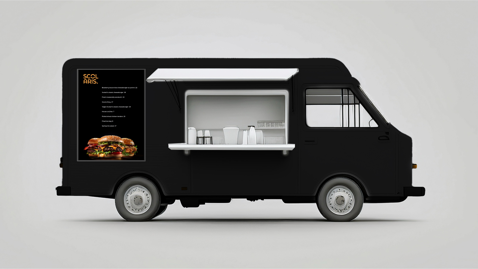
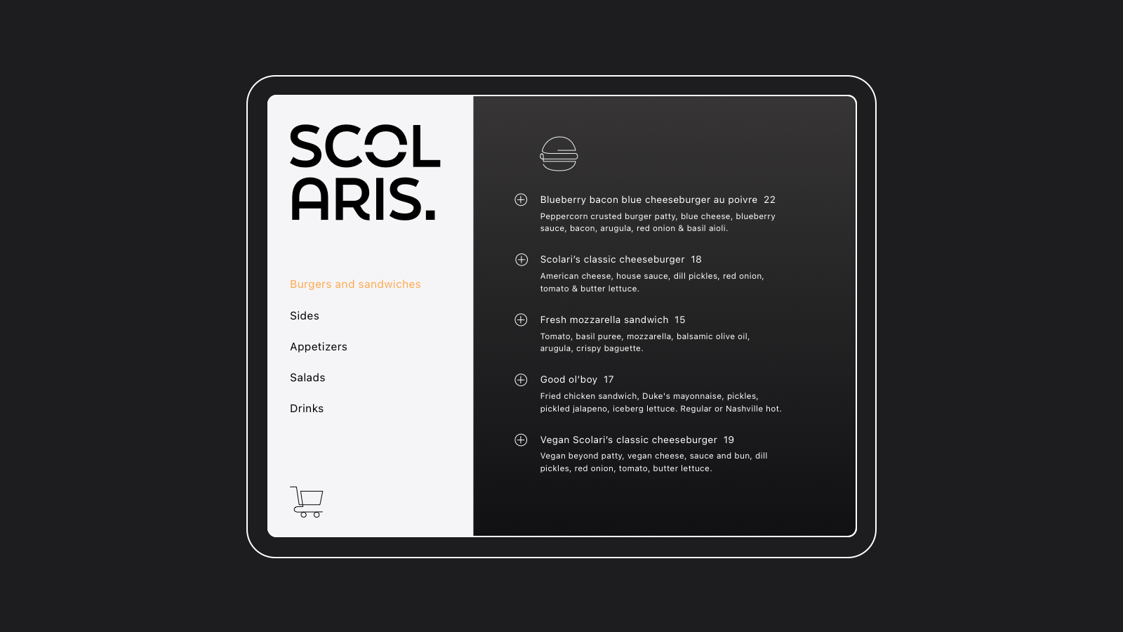
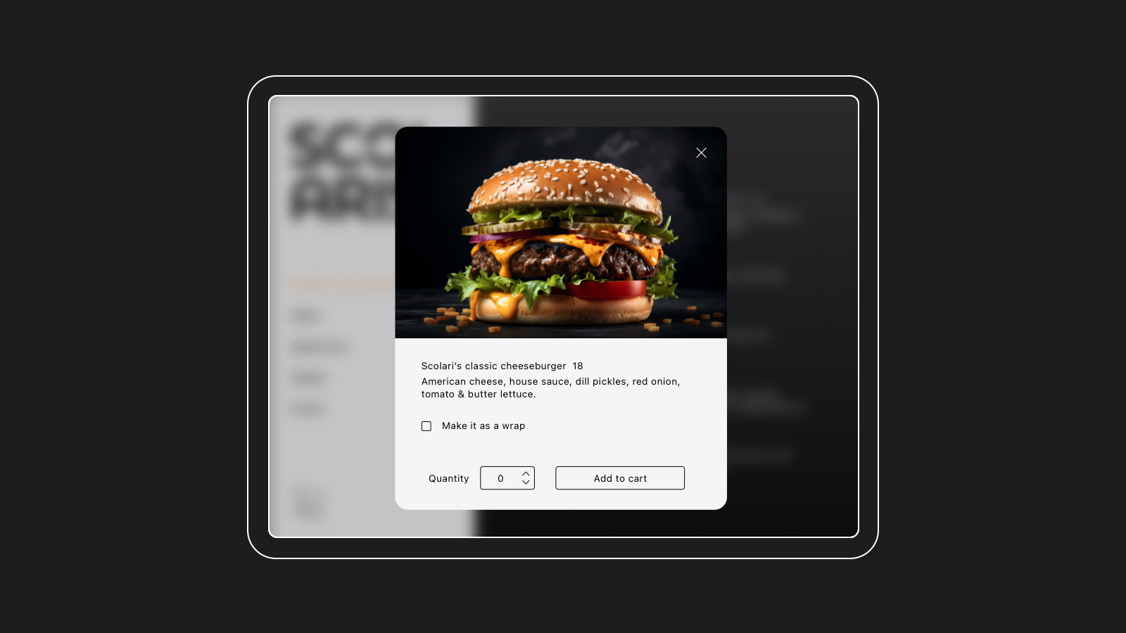
To solve peak-hour congestion, I designed a self-service tablet system installed directly at the truck. Observational research showed customers often hesitated during ordering, creating bottlenecks, and early user testing confirmed that too many steps increased both wait time and errors. These insights led to an interface that mirrors the website for immediate familiarity and uses a simple three-step flow (Choose → Customize → Pay) optimized for speed, outdoor visibility, and cognitive ease. High contrast, large buttons, and clear confirmation states reduce mistakes—direct responses to pain points uncovered during testing. By introducing this parallel ordering channel, multiple customers can order simultaneously, significantly improving throughput, reducing perceived wait times, and smoothing the overall service rhythm.
The Scolari’s redesign aligned bold food quality with equally bold service speed. By reworking the brand identity and overhauling the full ordering ecosystem—website, online ordering, and on-site tablets—the experience reduced ordering friction and peak-hour bottlenecks. The new three-step tablet flow and streamlined site improved throughput by an estimated 30% and reduced perceived wait times by 40%. Customers responded positively to the cohesive, high-end identity, while the business benefited from faster service, clearer workflows, and a brand that finally matches the food.